EasyPark - A parking app you actually want to use
TIMELINE
Jul - Sept 2024PLATFORM
MobileROLE
Product Designer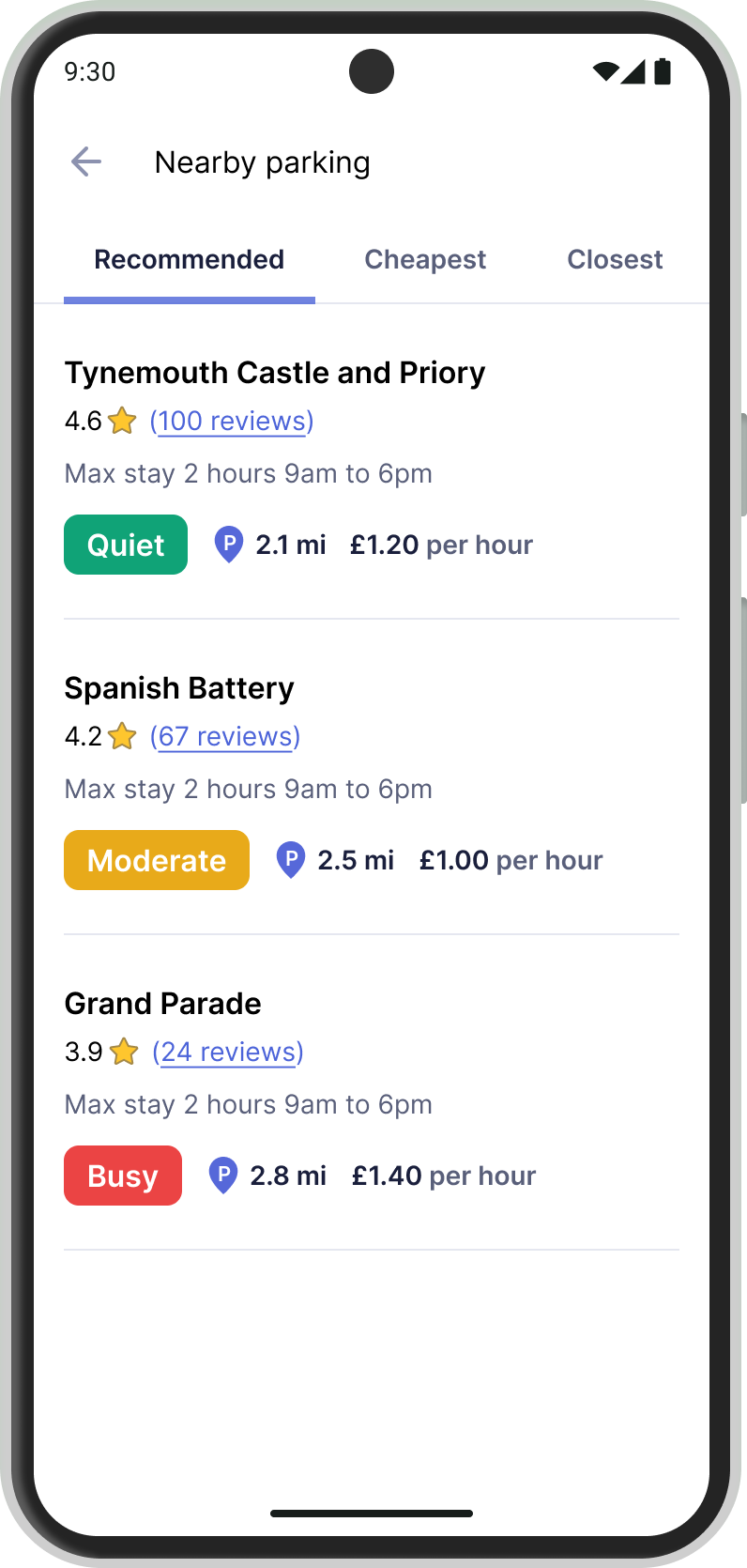
Parking apps are a nightmare! They confuse users with vague instructions, bury essential features, and make payments a hassle—so much so that people just stop trusting them. I'm sick of struggling with poorly designed parking apps. I want to create one that people actually enjoy using.
Through user research, interviews, and surveys, I learnt what users actually want from a parking app. Using these insights, I designed EasyPark, a new app built around the needs of its users.
EasyPark is a project I created during the Course CareersCourse Careers UI/UX design course. As a hands-on learning experience, I handled everything myself, from user interviews and surveys to high-fidelity designs and prototyping.
I surveyed 25 users, and they taught me two important things: RingGo and PayByPhone are the most popular parking apps, and users care less about finding a parking space and more about making the payment process easy.
of respondents said that payments are the most important feature of parking apps.
of respondents said their preferred parking apps are RingGo and PayByPhone.
of respondents said they'd like better parking data.
Through my interviews, I learned that users don't really care about parking apps; they just want a quick and easy way to pay for parking.
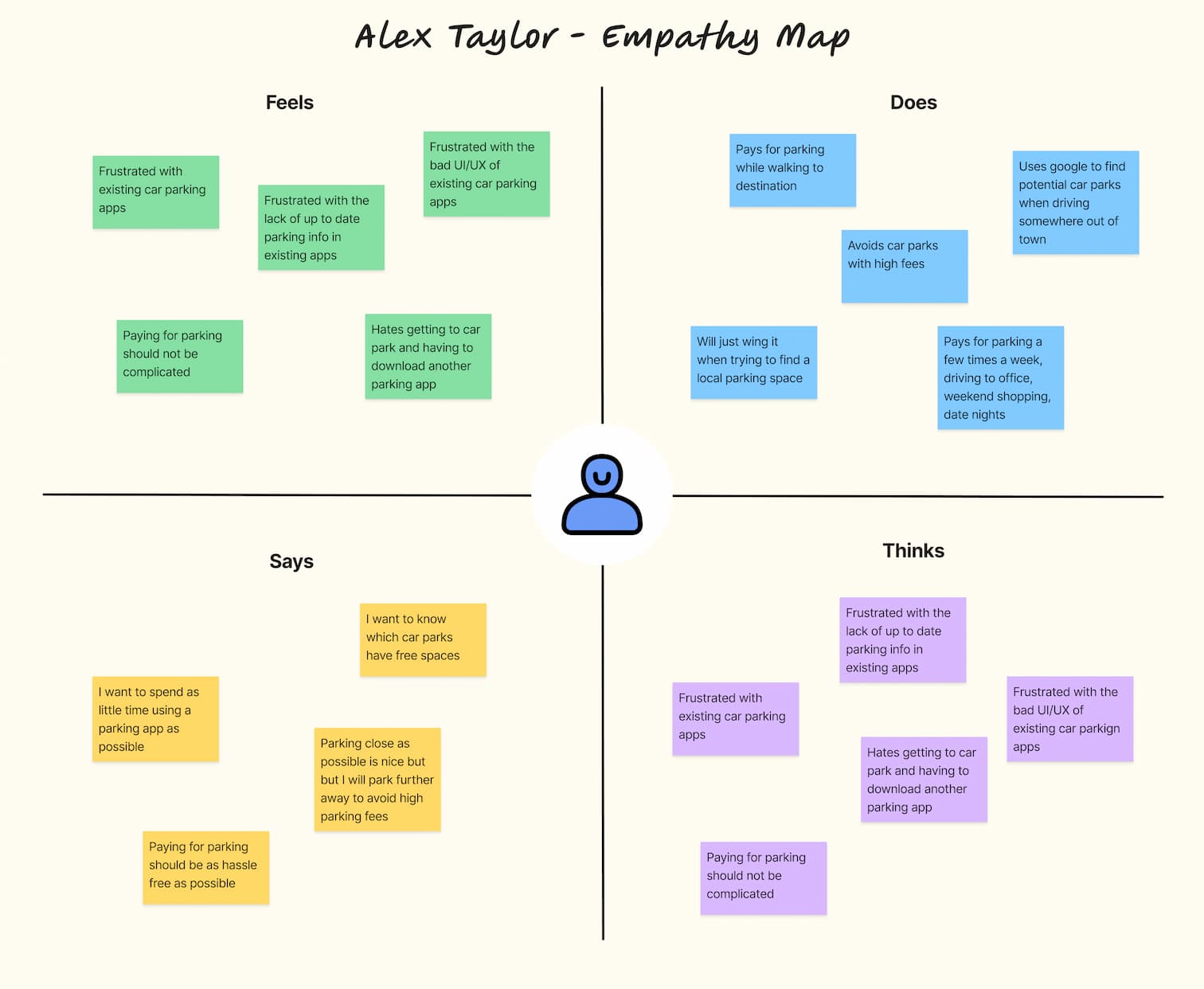
“My ideal parking app is one I never have to open. I park, it automatically handles the payment, and I can go on with my day.”
MARCO ANGELOUsers have many pain points with parking apps, but it's not about missing or better features; they want a better user experience. My research shows that the issue is how these core features are implemented.
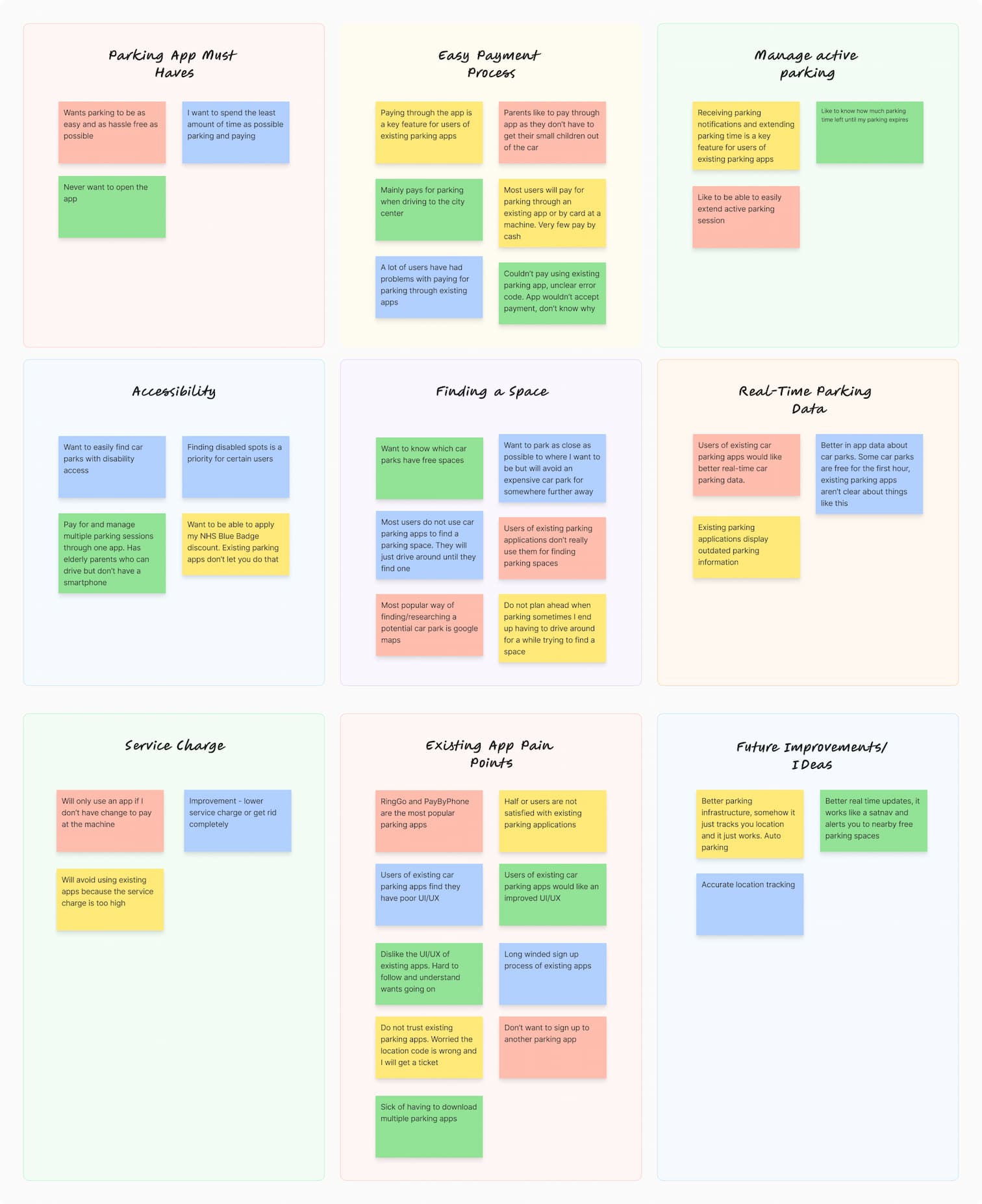
RingGo and PayByPhone are the two most popular parking apps, but they share the same problem: poor UI and UX. They offer features users want, such as payments, finding parking, and parking alerts, but they wrap them in a frustrating user experience.
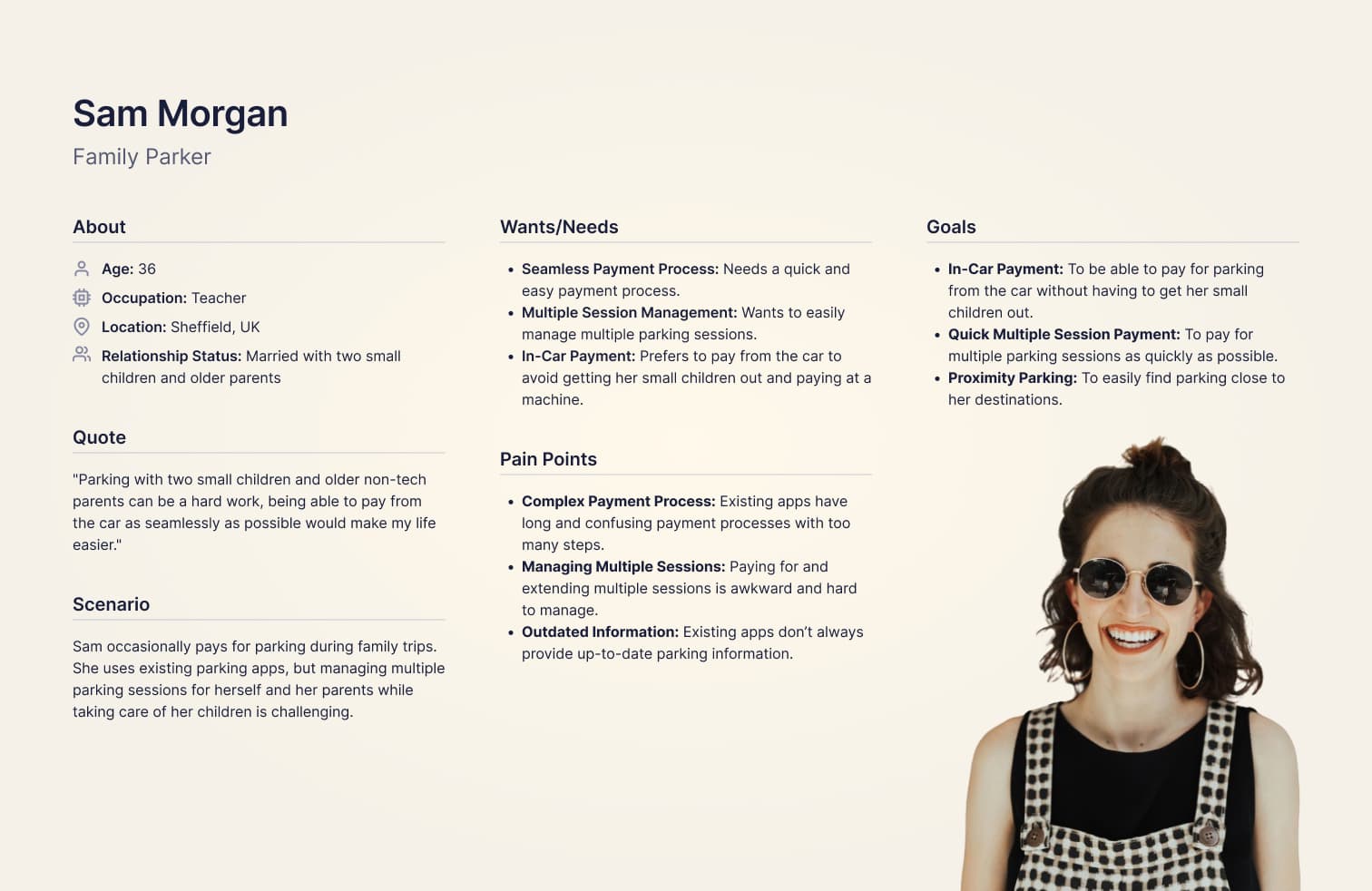
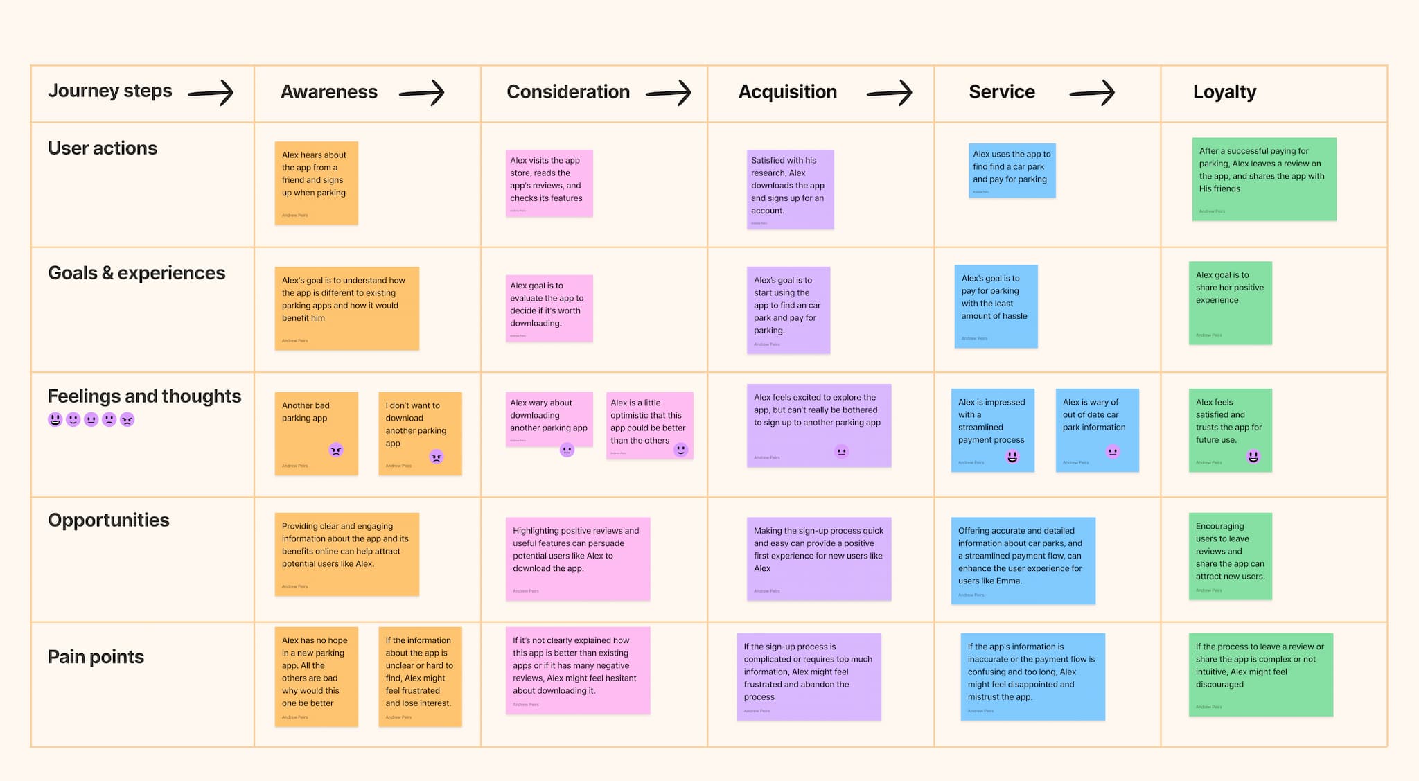
My research revealed two distinct types of users:
The solo parker - Professionals who drive to work, the gym, or to meet friends.
The family parker - Parents with young children, whose driving is mostly for school runs, outings, and family visits.
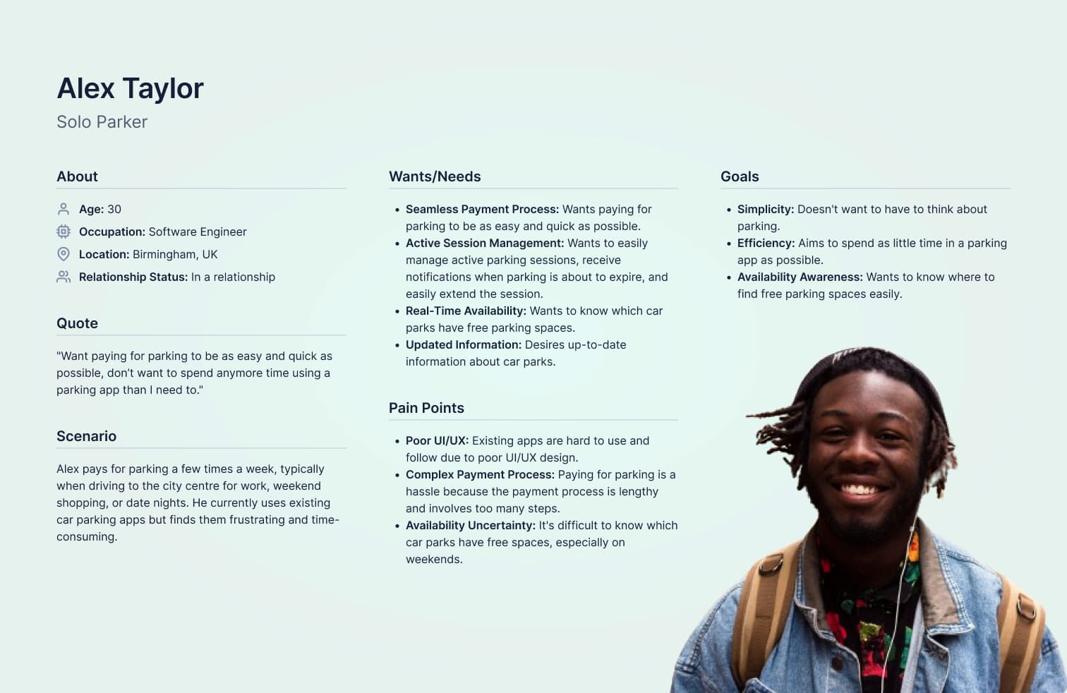
Alex isn't concerned with finding the cheapest parking spot; he just wants a fast payment process so he can get on with his day without having to think about parking.
Sam on the other hand, wants a quick and easy payment flow. With two kids fighting in the backseat, parking is already stressful, and she doesn't want to add the frustration of struggling with a crappy app.
Alex and Sam are skeptical about trying another parking app; most of them are awful, so why would EasyPark be any different? To win them over as daily users, I need to make a strong first impression with EasyPark and offer a super simple sign-up process. Otherwise, I risk EasyPark being dismissed as just another crappy parking app.
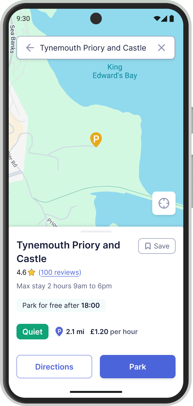
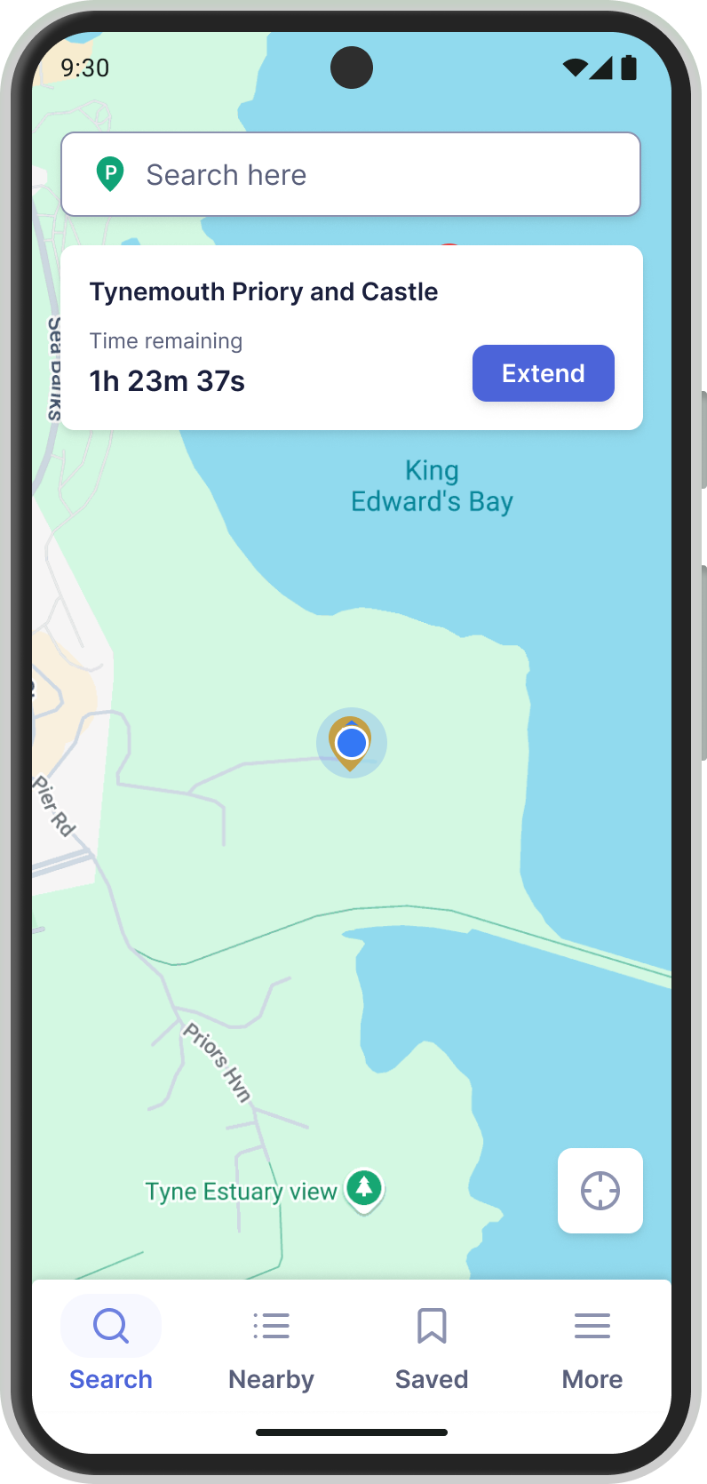
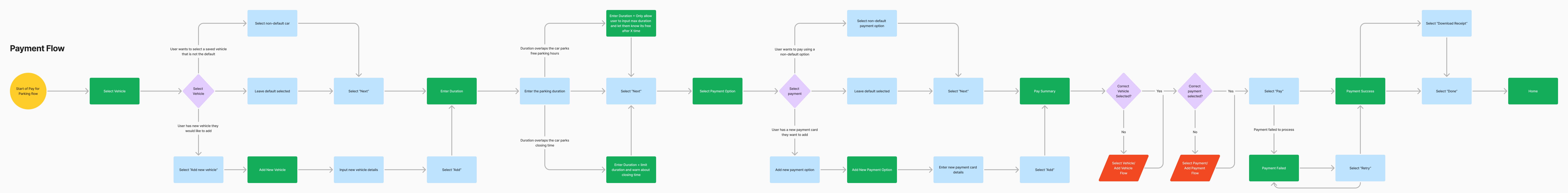
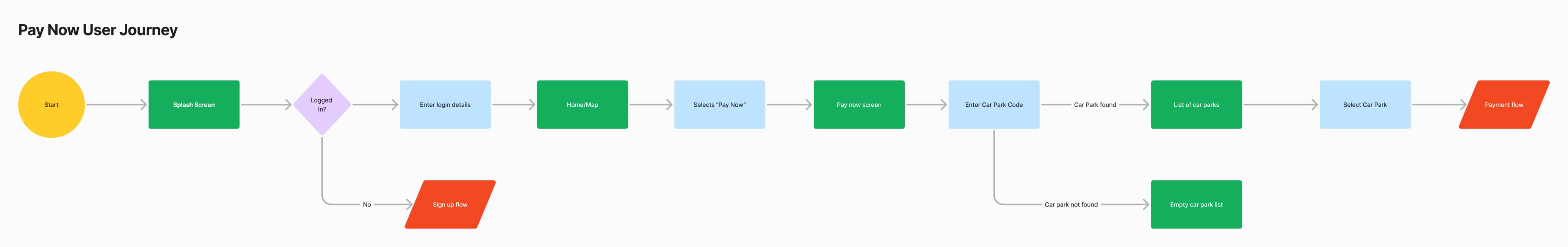
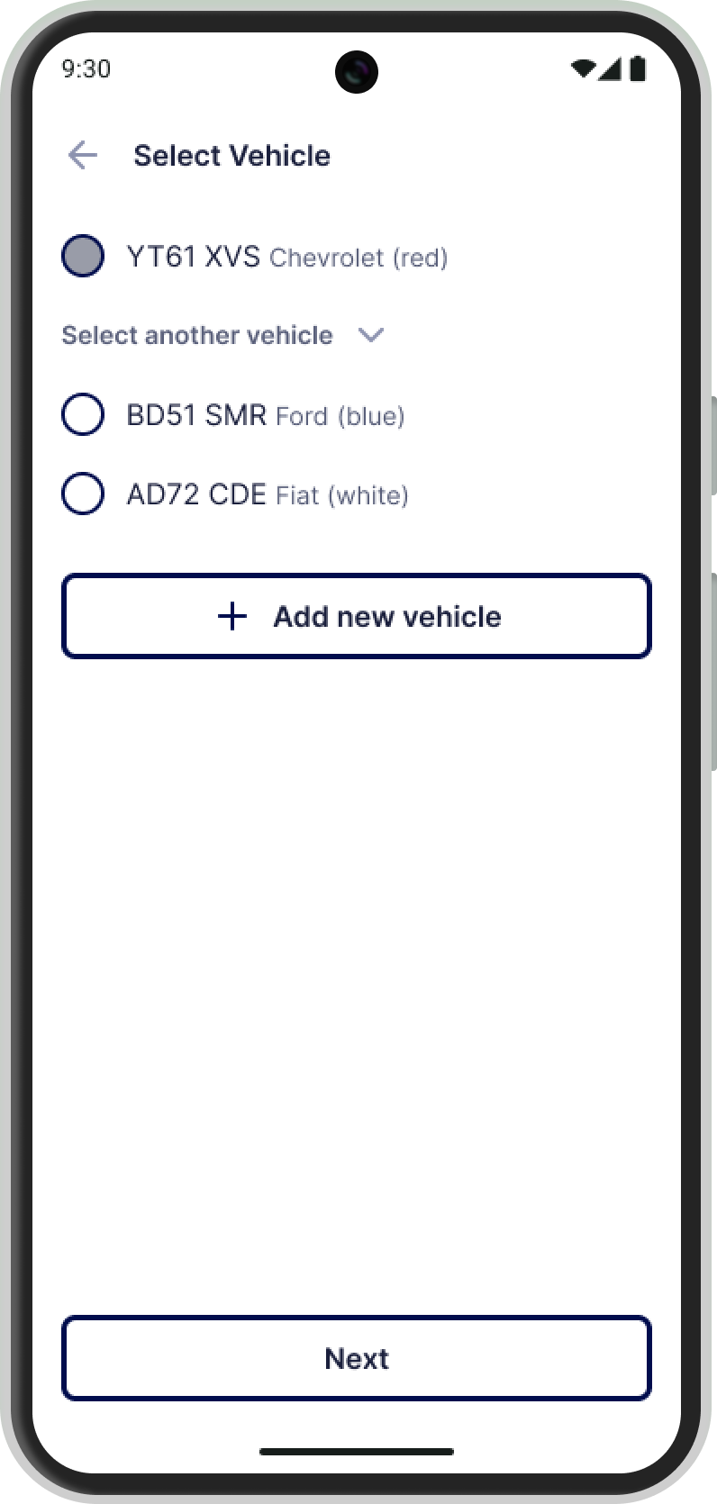
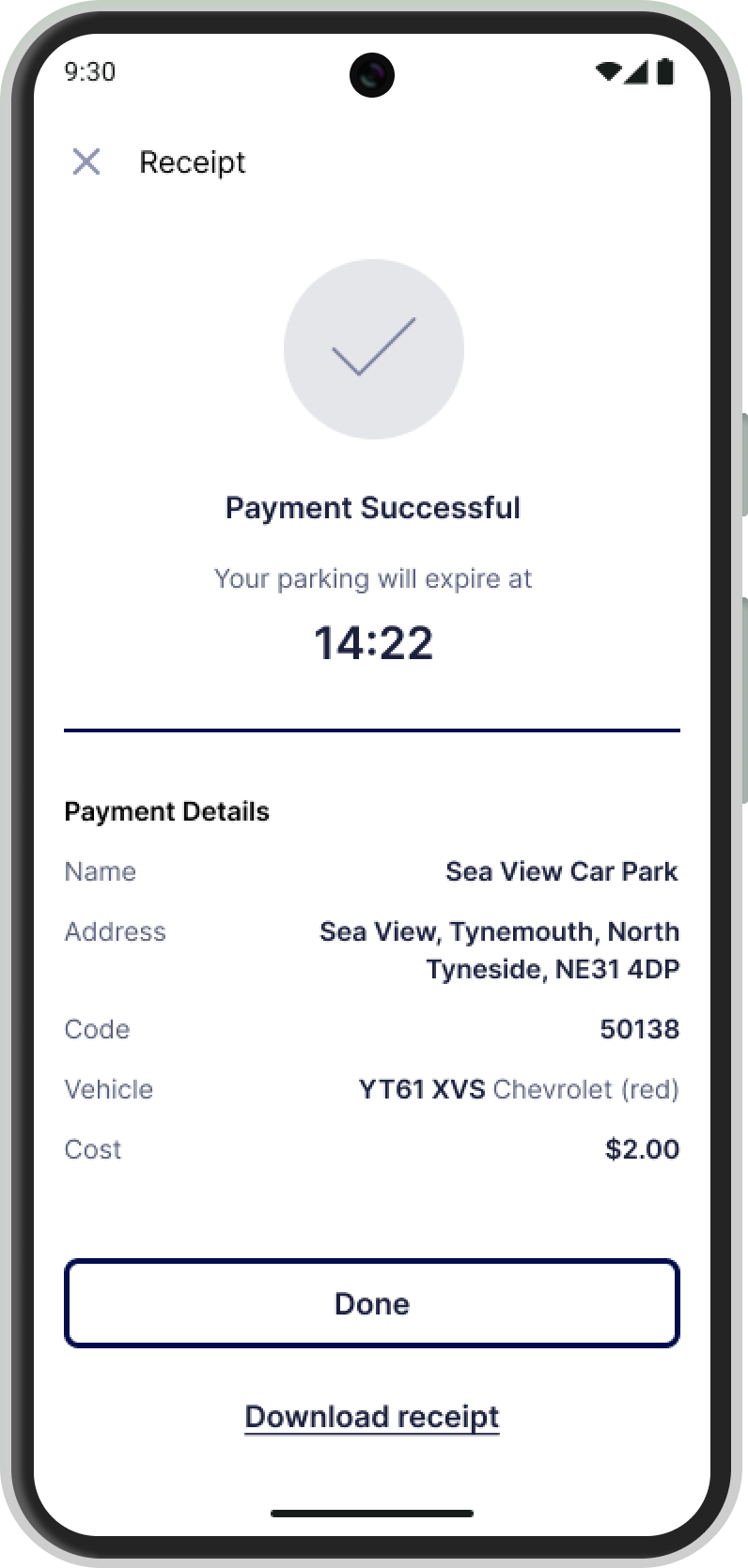
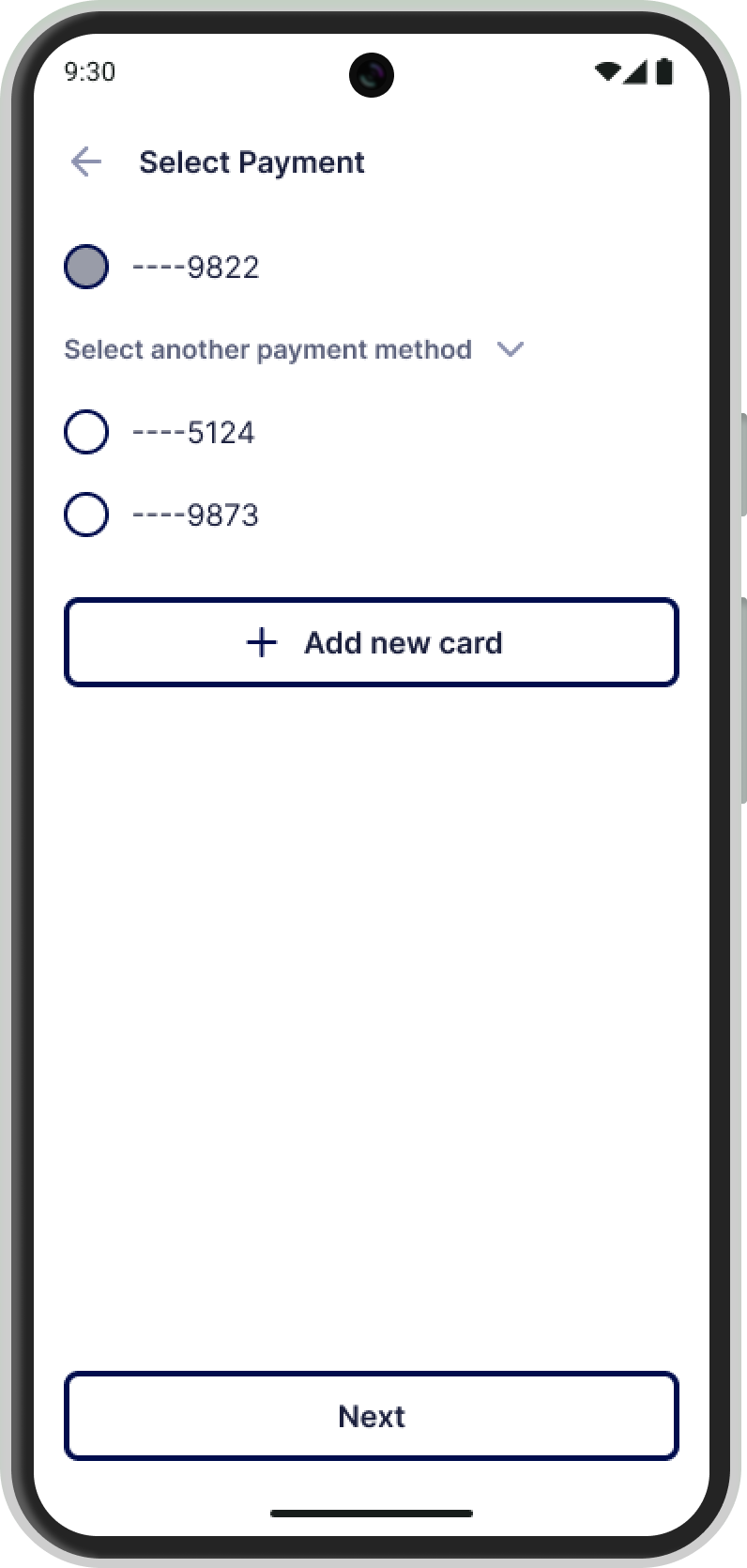
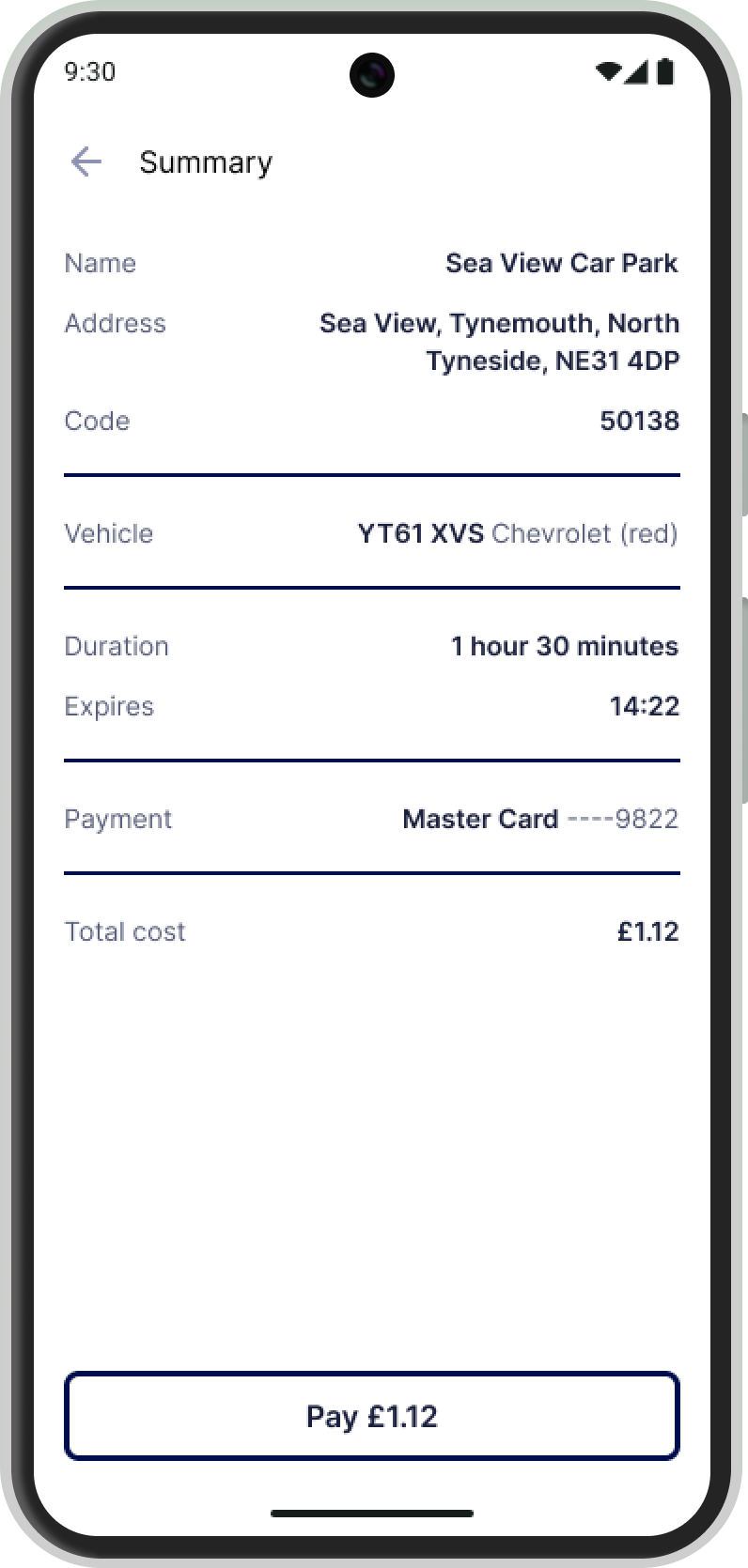
Payments are the core feature users want, and Alex and Sam don’t want to get stuck in a frustrating payment flow. They just want to pay quickly and get on with their day. The payment flow should:
Be a series of simple steps with clear instructions.
Preselect the user's default payment and vehicle options.
Handle edge cases, like expired payment methods, smoothly.
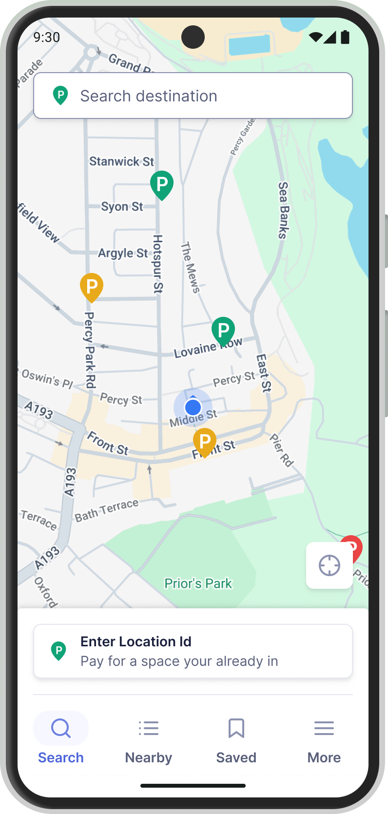
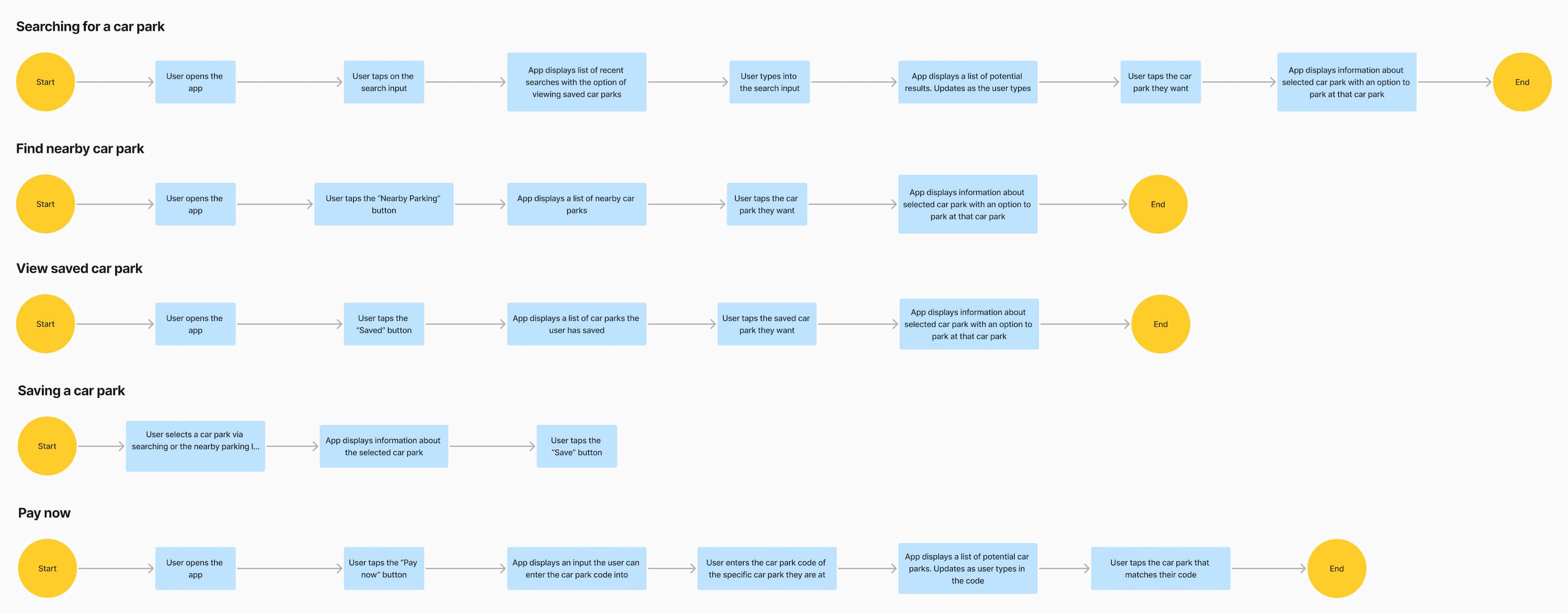
Finding a parking spot should be super easy. Alex and Sam want to open the app and immediately see a map centered on their location, where they can either browse the map to find a parking spot or type an address into a search bar.
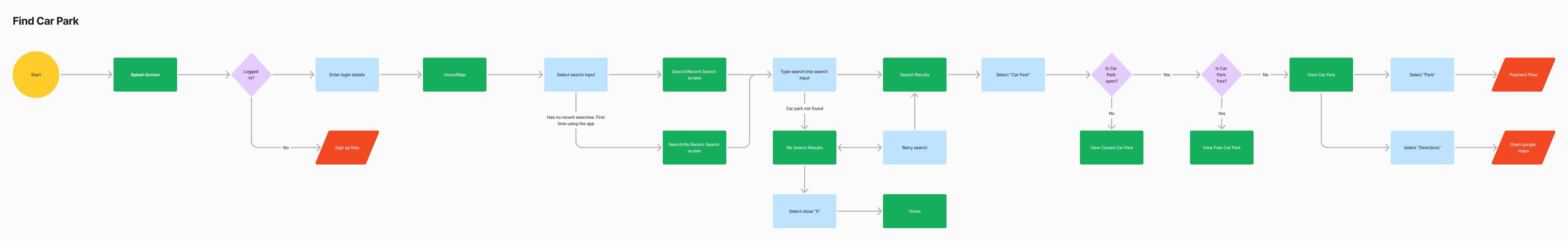
Frequently, Alex and Sam will drive to a car park and only open the app when it's time to pay. They don’t want to deal with maps or go through the "Finding a Car Park" flow. They just want a shortcut that takes them straight to the payment flow.
I have a ton of ideas about how Payments, Finding a Car Park, and Pay Now should look and feel, but what's right and what's wrong? I'm not sure. So, I went through multiple sketches and wireframes to quickly test what worked and what didn't for these features.
I searched for design inspiration everywhere I could. I found it in existing parking apps like RingGo and PayByPhone, in my own sketches and wireframes, and on platforms like Behance, Dribbble, and Mobbin.
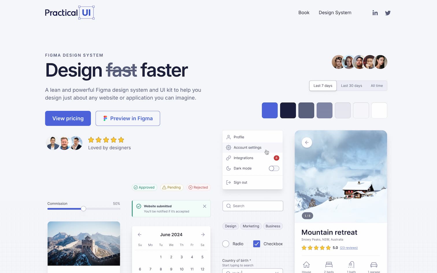
To save time, I decided to use an off-the-shelf design system. I chose Practical UIPractical UI because it offers a set of clean, simple, minimal, and high-quality UI components that are fully accessible.
I created my final designs using Practical UI and the inspiration I found online. Once the designs were complete, I turned them into a Figma prototype.
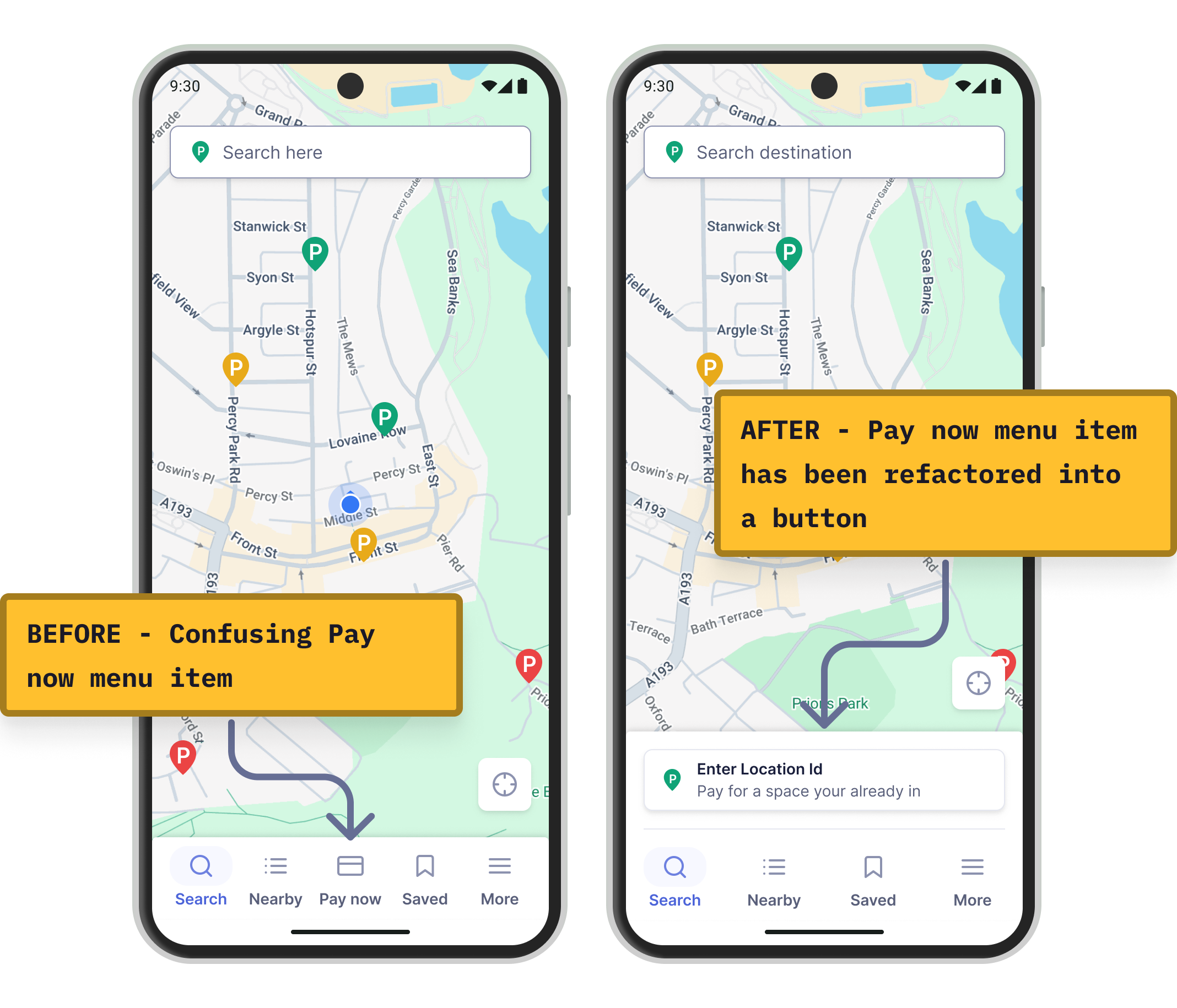
I conducted a series of user tests to see if users found EasyPark easier to use. Overall, things went well; users could easily pay for parking and find the car park they wanted. But they all ran into the same issue: What is "Pay Now"? What does it mean?
In my original designs, "Pay Now" was just a button in the nav bar. To make it clear that it's a shortcut to payment, I moved it out of the nav bar and gave it its own button with clear instructions.
Most parking apps are frustrating to use. They offer features users want, but the poor UX makes them hard to use. Through user research and a focus on real user needs, I created EasyPark, a parking app built with the user in mind.
EasyPark is the first app I've designed, and I've learned a lot through the process.
Research is everything. Without it, you're just guessing what users want, and you can't build a successful app based on guesswork. You need solid user surveys and interviews to gather the data necessary to make design decisions that truly meet user needs. user.
Research is hard. There's an art to it, and I know it's an area where I need to improve. If you don't ask the right questions in the right way, you risk collecting data that leads you to design something you think users want—only to find out they don't.
Hold off on high fidelity designs. My favorite part of design is jumping into Figma and creating polished designs. But I've learned to resist the urge, as I've often ended up designing based on assumptions rather than solid user research.
Design for users not yourself. It's not about what you want—it's about what your users need. That's why user personas are so crucial. They help you step into your users' shoes and make decisions that are best for them, not for you.
EasyPark has been a great learning experience. I've learned the importance of user research, how to turn that research into user personas, and why designing for the user is always the priority. There's still a lot for me to learn, but I definitely feel like I'm on the right path to becoming a UI/UX designer.