Super Minesweeper 3000
TIMELINE
Dec 2024PLATFORM
WebROLE
Product Designer, CoderWith this project, I wanted to achieve two things: have some fun and understand why I love retro Braun products so much. I decided to take a simple game, code it from scratch, and design it with a retro Braun look and feel.
Minesweeper is a classic game with set features, but I wanted to explore how other designers add their own personality to it.
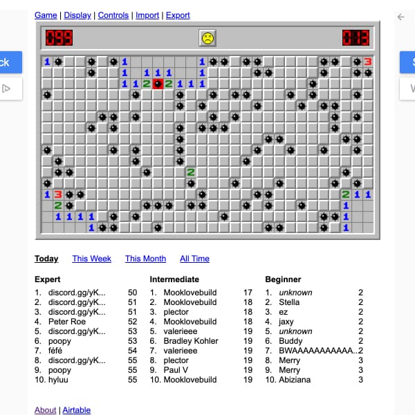
Minesweeper onlineMinesweeper online - Sticks to the classic look and feel, with a focus on stats, leaderboards, and competition.
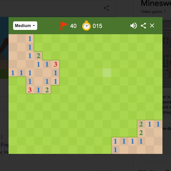
Google minesweeperGoogle minesweeper - A basic design, but with great win/lose animations.
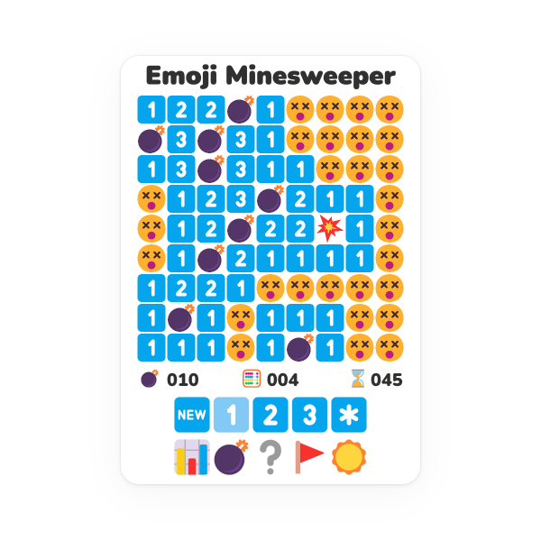
Emoji minesweeperEmoji minesweeper - A fun, vibrant design, all crafted using emojis.
I’m a big fan of Braun products designed by Dieter Rams. I love the colors, smooth corners, minimalist aesthetic, and the product names. I wanted my Minesweeper game to capture that same look and feel. To get my head into that space, I researched a range of Braun products and created a mood board for inspiration.

For the color palette, I chose DR09 by Matus HatalaDR09 by Matus Hatala, as it closely matches the style of my favorite Braun products.

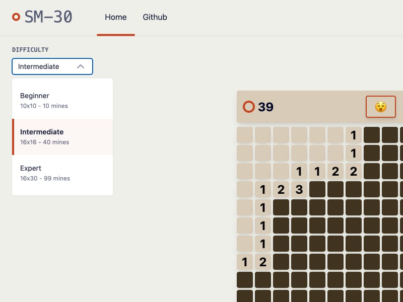
I wanted to stick to the classic Minesweeper layout while applying the UI design principles I learned from Braun:
A super strong visual hierarchy
A minimalist look and feel
Soft, rounded corners; no sharp edges
The game cells need to look and feel like they belong together, but some should blend in while others stand out. To achieve this, the visual hierarchy must be solid.
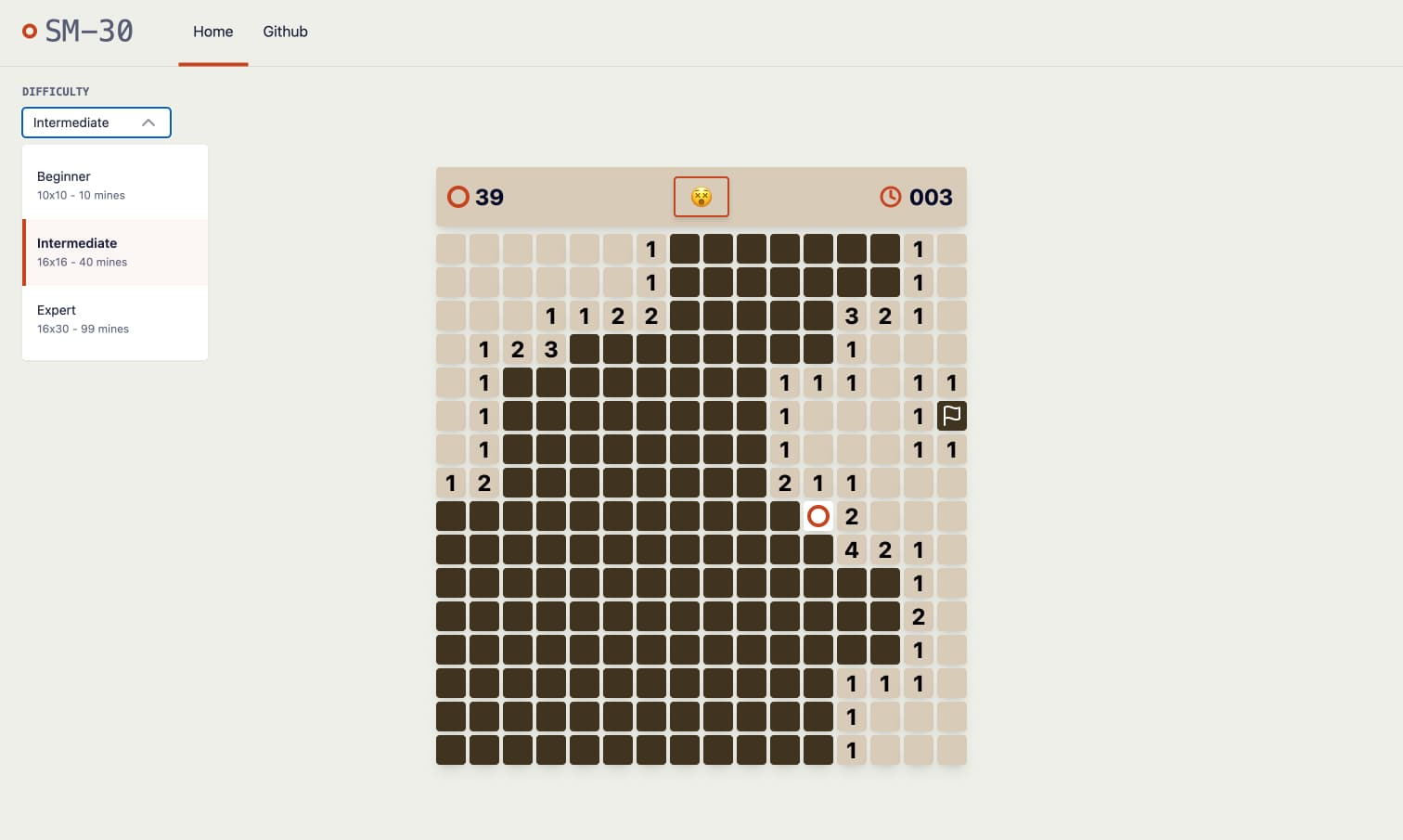
Each cell can be in one of five states.

Default
It should be easily visible but not draw attention away from the other cells.
Empty
It should blend into the background and be visible to the player, but not demand much attention.

Touching
It should clearly communicate the number of mines it's touching, as this is crucial information for the player. A bold number helps achieve this.

Mine
It needs to grab the player's attention! When a player clicks a mine, it's game over, so they must be clearly alerted. A red mine on a white background creates strong contrast, making it stand out from the other cells.

Flagged
It needs to stand out and clearly indicate it’s been marked, without overpowering the touching or mine cells. A white flag achieves this balance.
Its a classic part of Minesweeper, but I wanted to give it a more modern touch. Inspired by Emoji Minesweeper, I decided to use emojis, adding a bit more personality to the game.
The game board is the focal point of the UI and should hold the player's attention. Everything else is secondary. I pushed all non-gameboard elements to the edges of the screen to ensure they don’t distract from the gameplay.
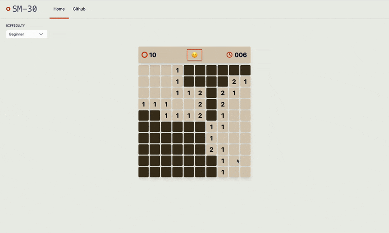
I initially started with Super Minesweeper 3000, inspired by the old Super Nintendo games I played as a kid, like Super Mario Bros, Super Metroid, and Super Street Fighter II.
But I also wanted it to have the clean, minimal feel of a Braun product—something like the TP4, SK 2/2, or KSM 1/11.
To capture that, I shortened Super Minesweeper 3000 to SM-30, giving it a more Braun-inspired, streamlined name.
Check out the live version below, or follow the link to the production site.
View live versionI set out to create a Minesweeper game inspired by retro Braun products, and I feel I've achieved that. I took the classic Minesweeper layout and applied design principles I learned from studying Braun products. I crafted a clear visual hierarchy to make the key features stand out, kept the design minimal, and used a Braun-inspired color palette to give it a retro aesthetic.
I’ve learned two fundamental principles from studying Braun products:
A good visual hierarchy is super important. Using color, contrast, and balanced spacing to ensure core features stand out, are easily understood, and are simple to use.
Keep things minimal. A great product doesn't need a ton of features. It's not cluttered or trying to do a thousand things. Braun products focus on one core feature and implement it as perfectly as possible.
I feel my Minesweeper game is missing a hook to encourage players to return. Adding stats could provide that incentive. I'd track things like:
Total games played
Games won
Win percentage
Quickest time
Total moves made
Total time played
A strong visual hierarchy is key to creating a simple and user-friendly product. Braun exemplifies this by using color, contrast, and balanced spacing to make the core features of their products clear and easy to understand.