NordPass Redesign
TIMELINE
Nov 2024PLATFORM
WebROLE
UI Designer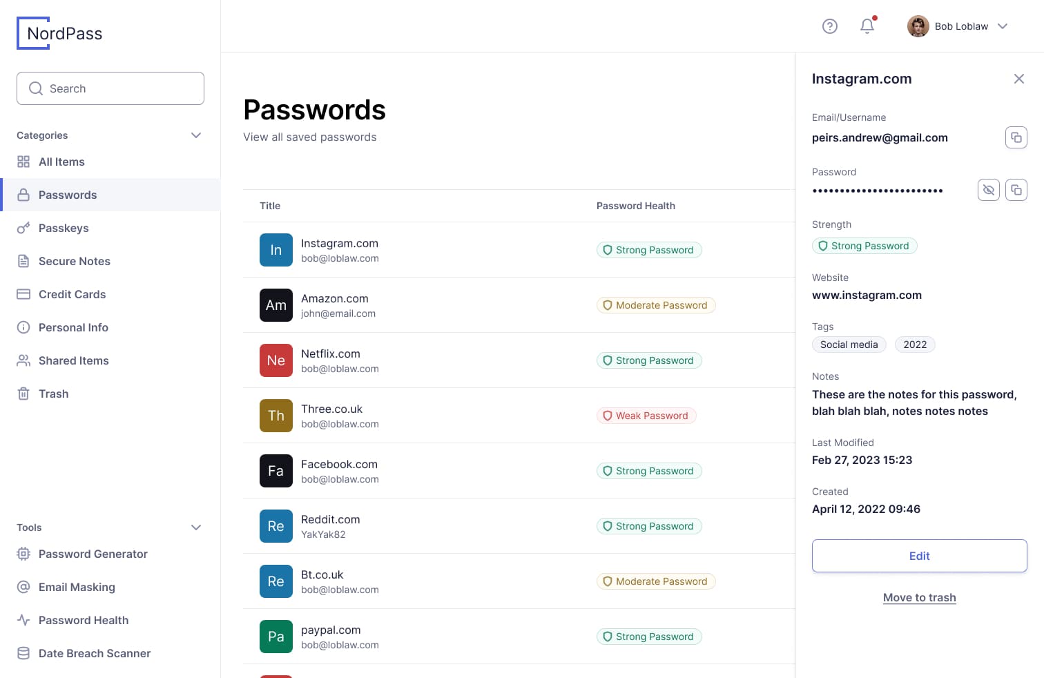
NordPassNordPass is a password manager developed by the team behind NordVPNNordVPN
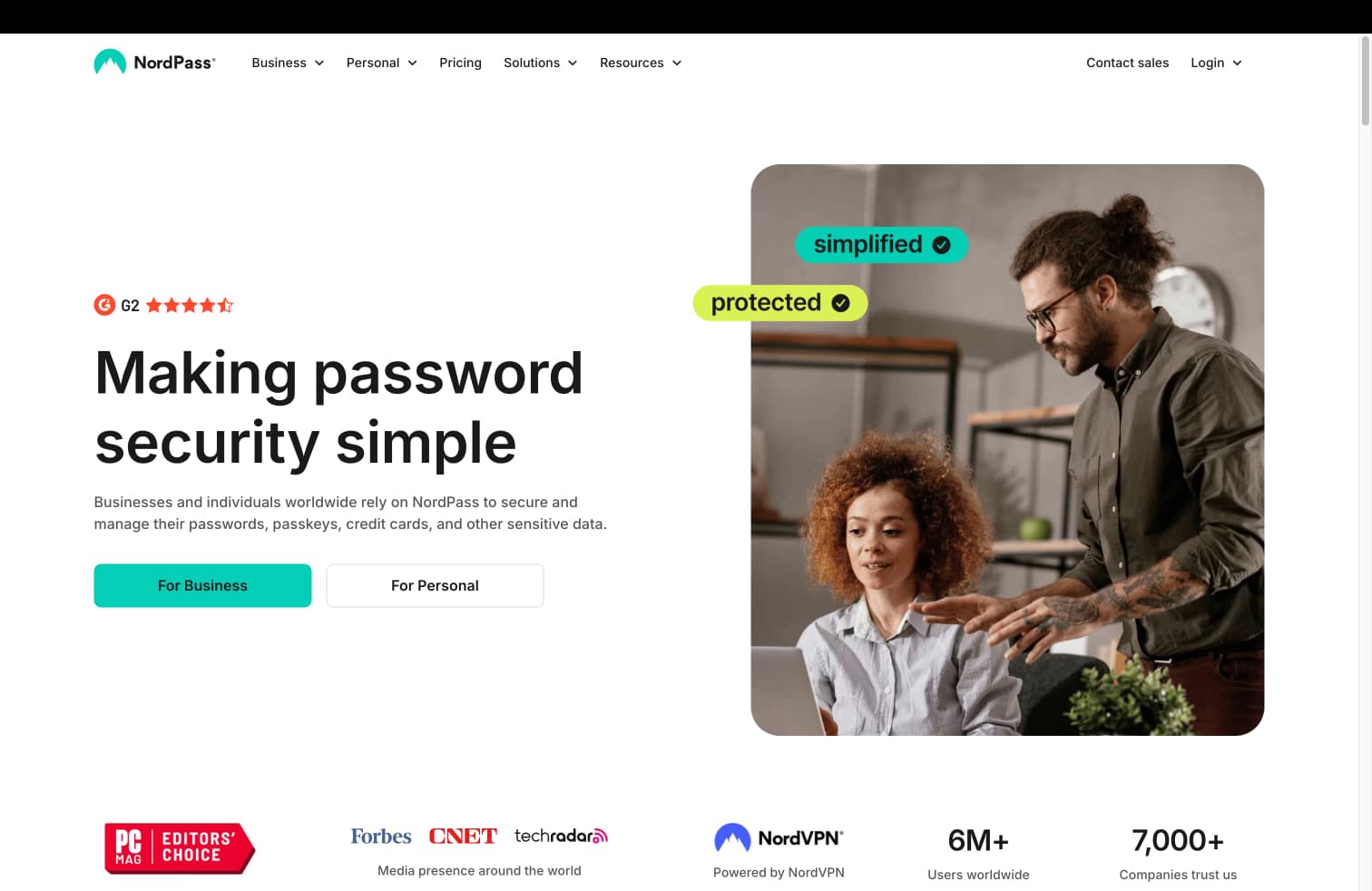
NordPass offers great features, but users often feel the UI is a bit of a mess. This is due to several simple design issues:
An unattractive UI
Forms that lack validation
Copy that doesn't sound natural
Missing feedback
Unaddressed edge cases
By applying basic design principles, I was able to transform NordPass into a modern, polished app that users would appreciate.
Here's what I did:
Used the Practical UI design systemPractical UI design system to create a sleek, contemporary UI.
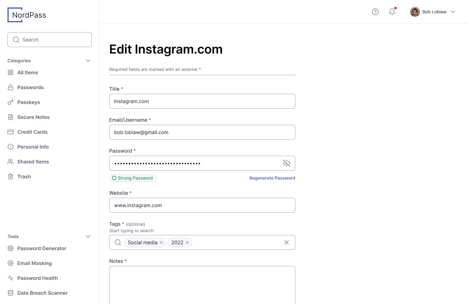
Improved the add/edit forms to include clear validation.
Updated the copy to sound more natural and user-friendly.
Added feedback to make the app feel responsive and in sync with the user.
Addressed edge cases, like handling generic errors and "no results" states.
NordPass is a personal learning project I worked on in my own time. It's a study in creating a professional UI. I designed everything myself using Practical UI and Figma.
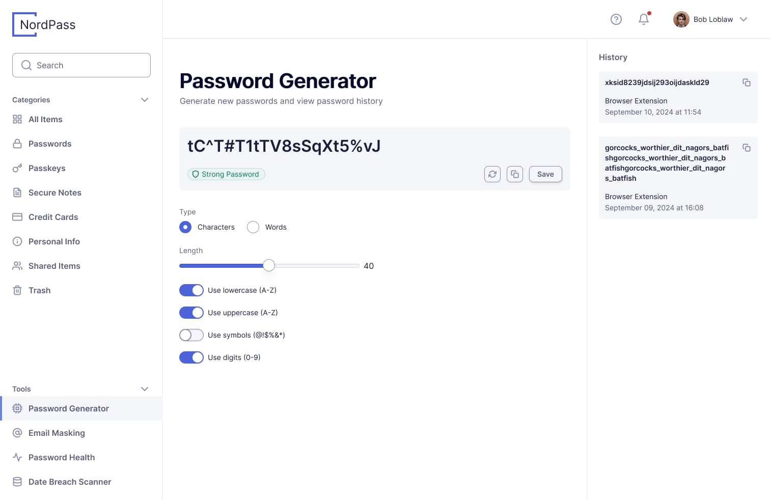
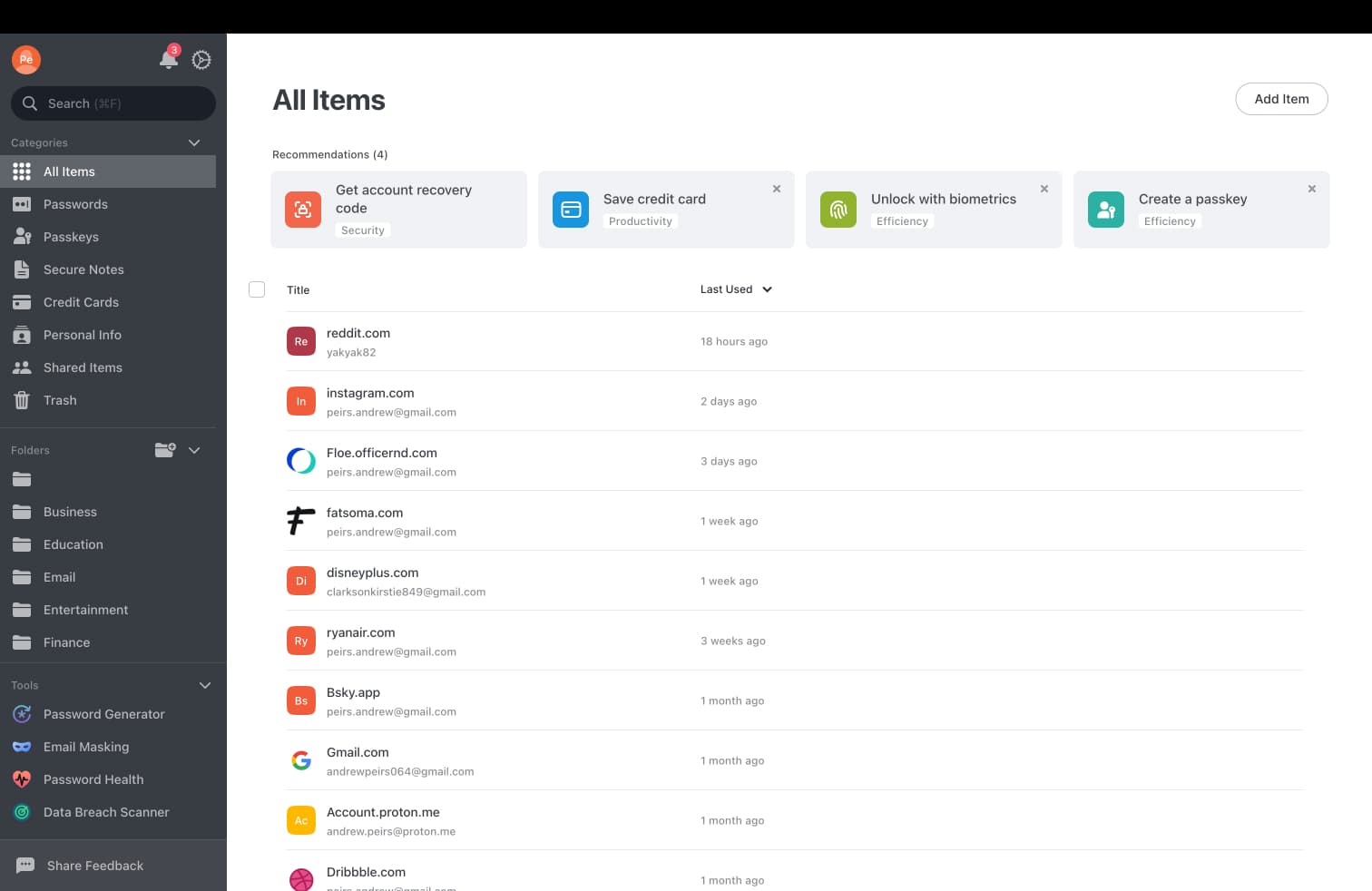
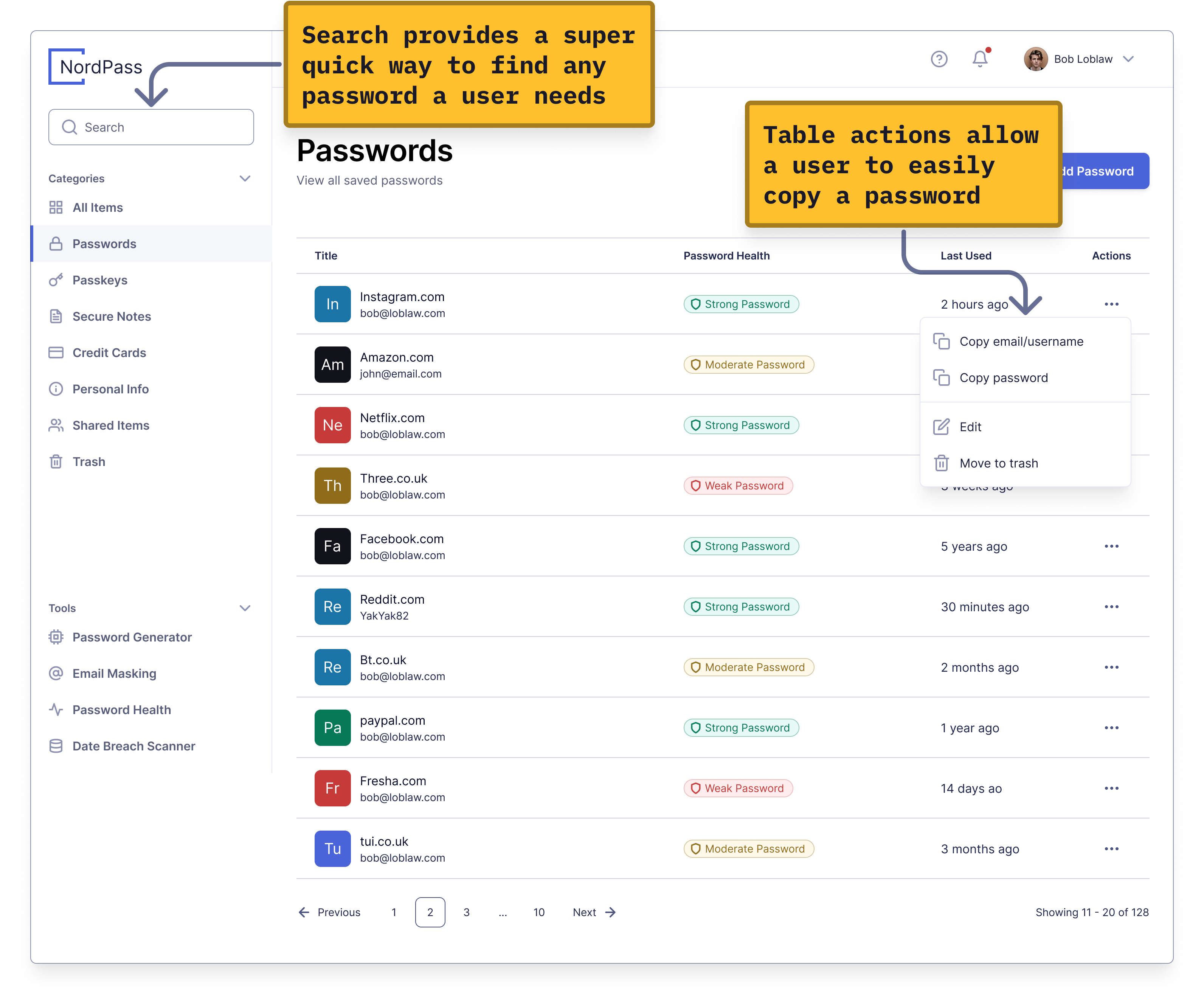
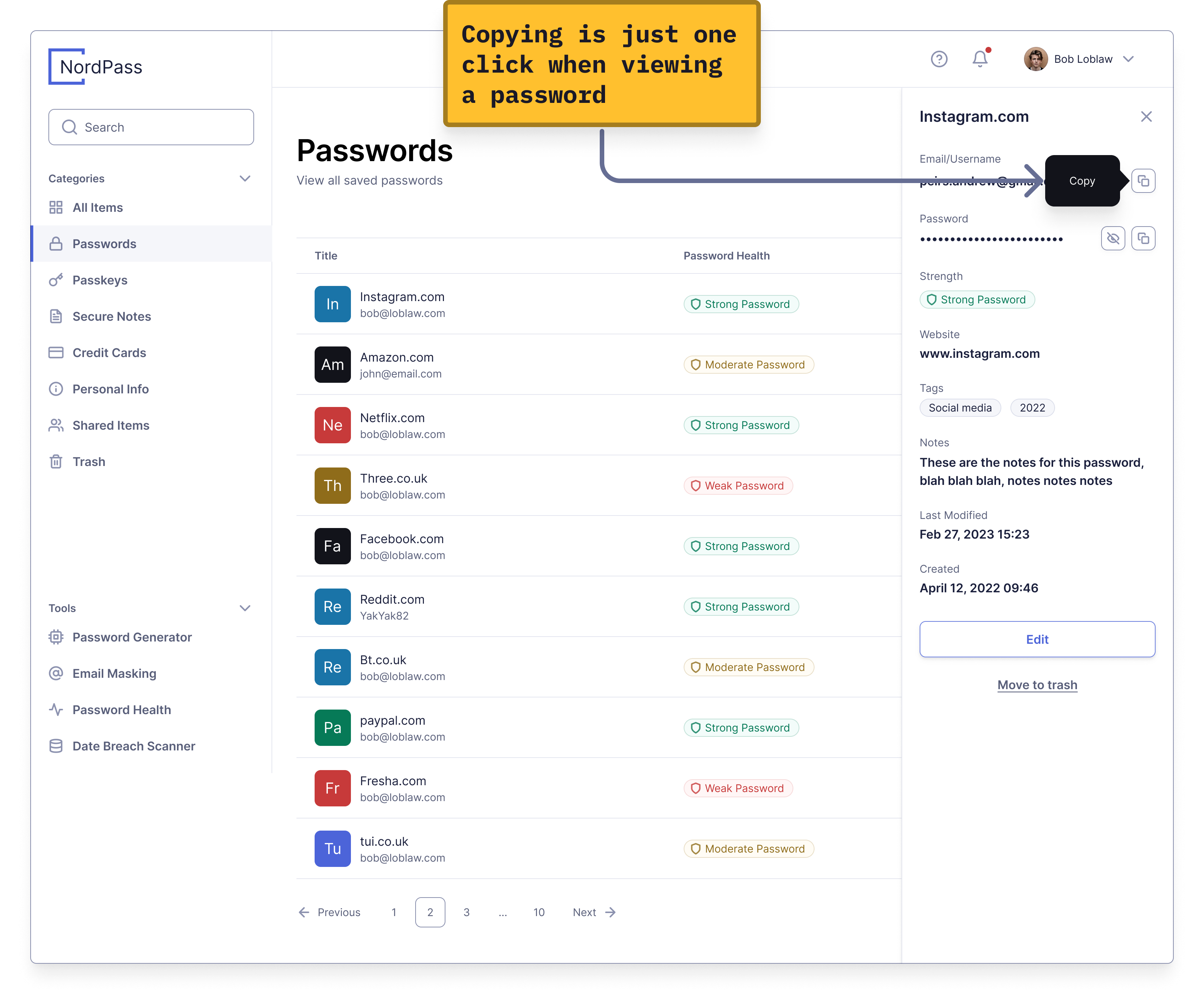
A key feature of any password manager is the ability to quickly copy passwords. I designed the UI so users are always just a few interactions away from the password they need.
A key feature of a password manager is allowing users to quickly copy their passwords. I designed the UI so users are never more than a few interactions away from the password they need.
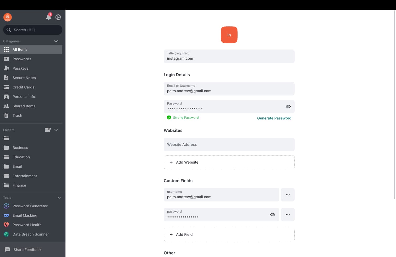
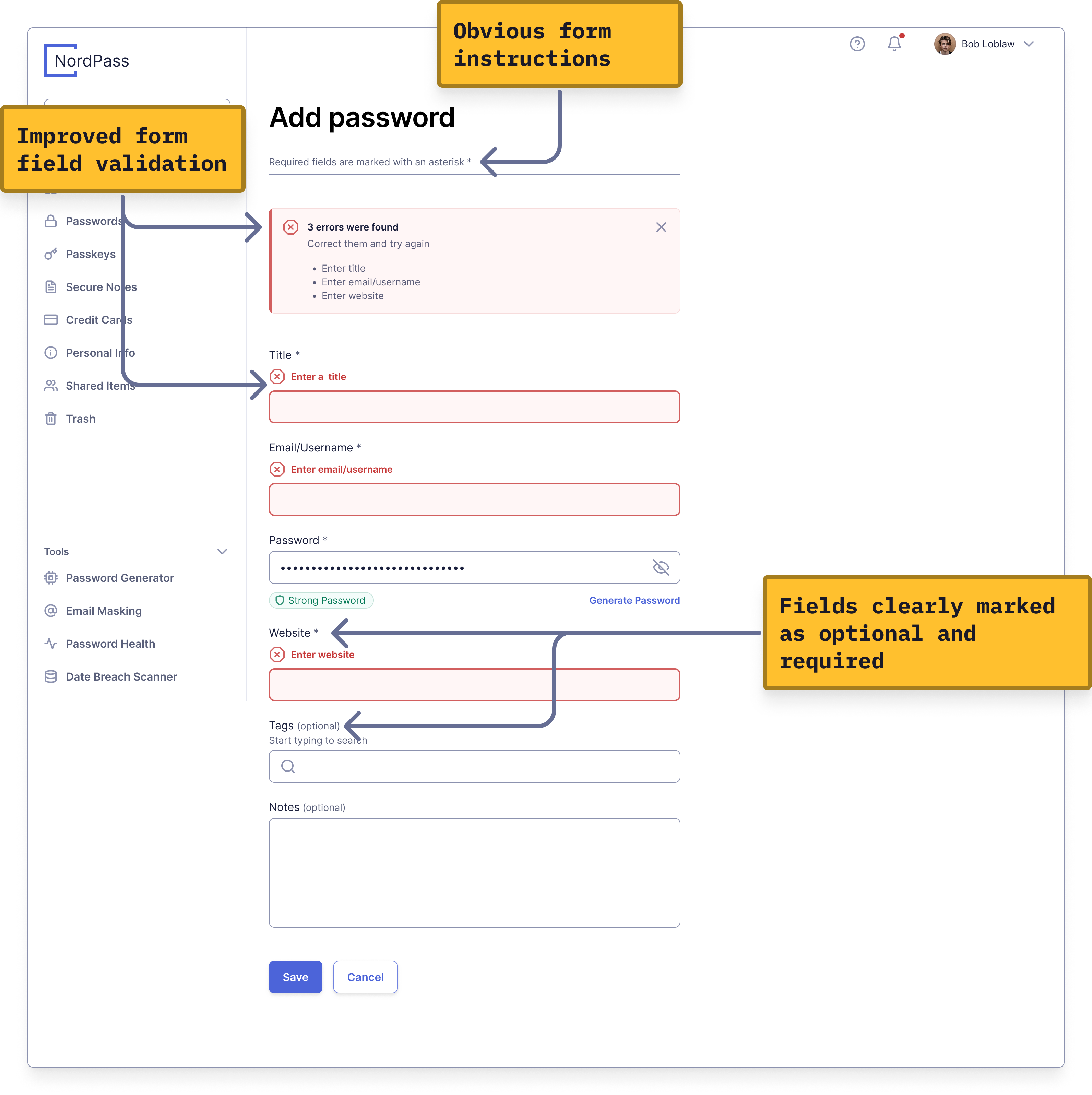
Without clear instructions and validation forms can be super frustrating and users can easily get stuck. The Add/Edit password forms in NordPass implemented basic validation and could be improved in a few simple ways.
Clear copy is essential. It helps users understand exactly what's happening and prevents confusion. NordPass has several instances of vague copy that need improvement.
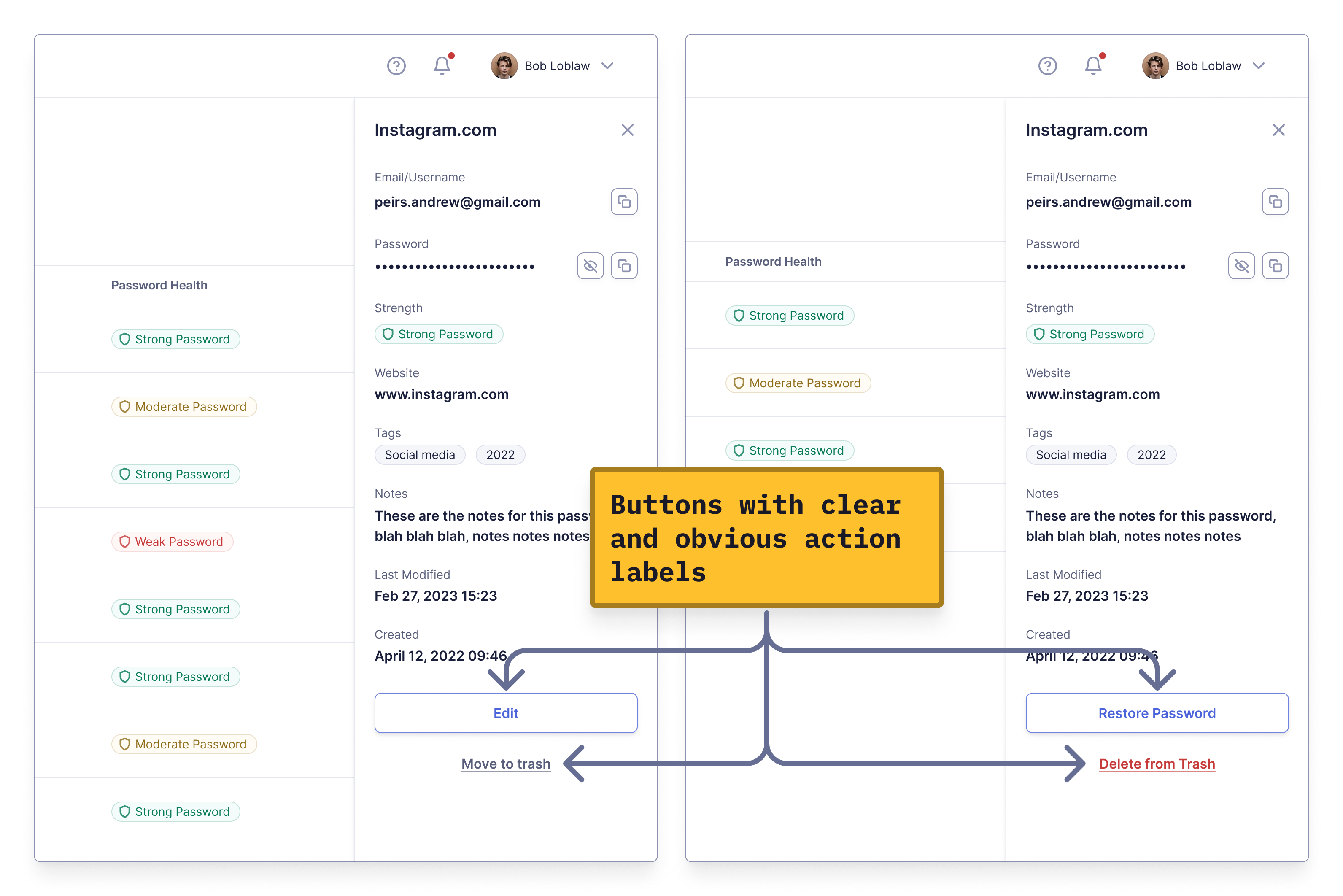
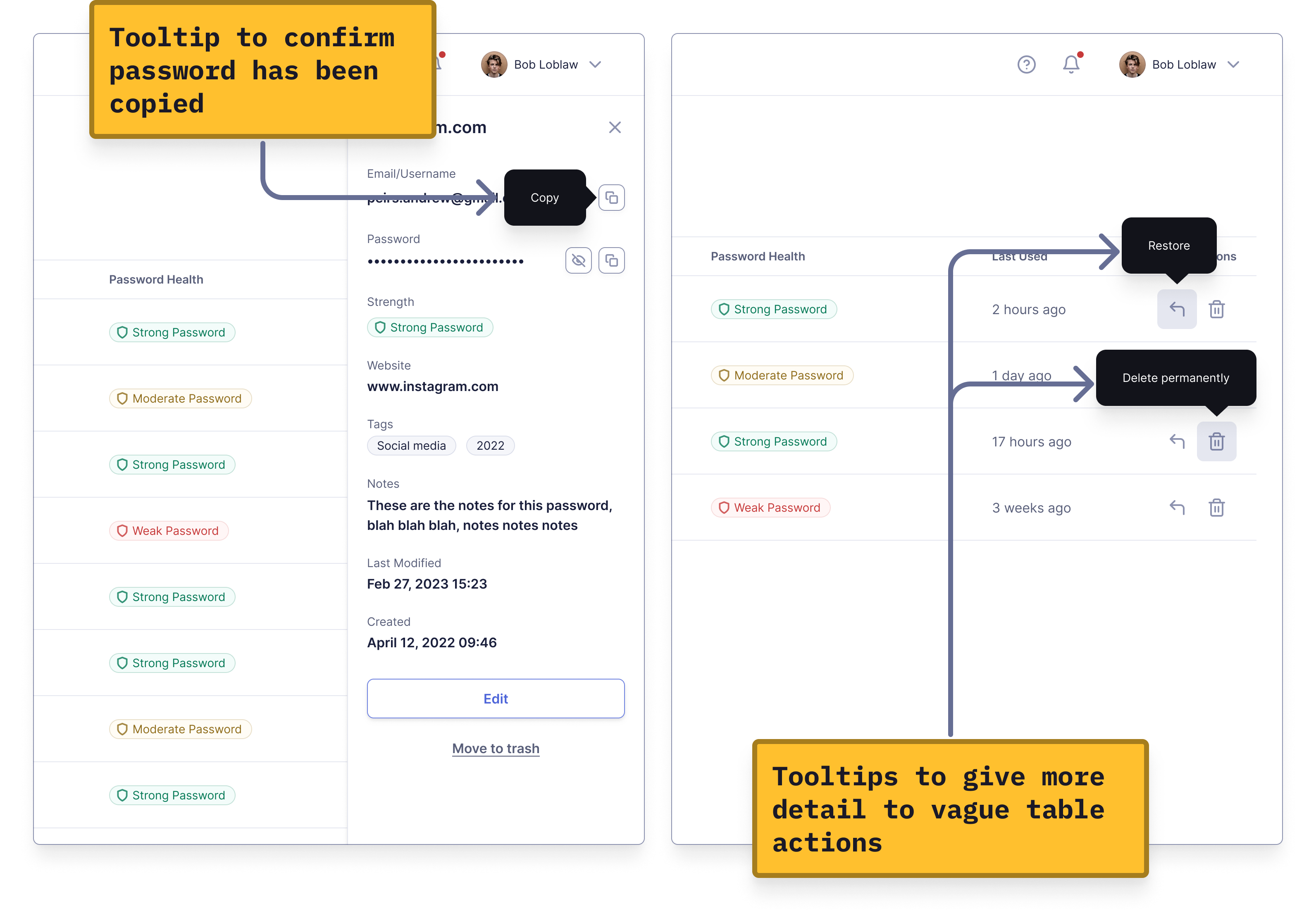
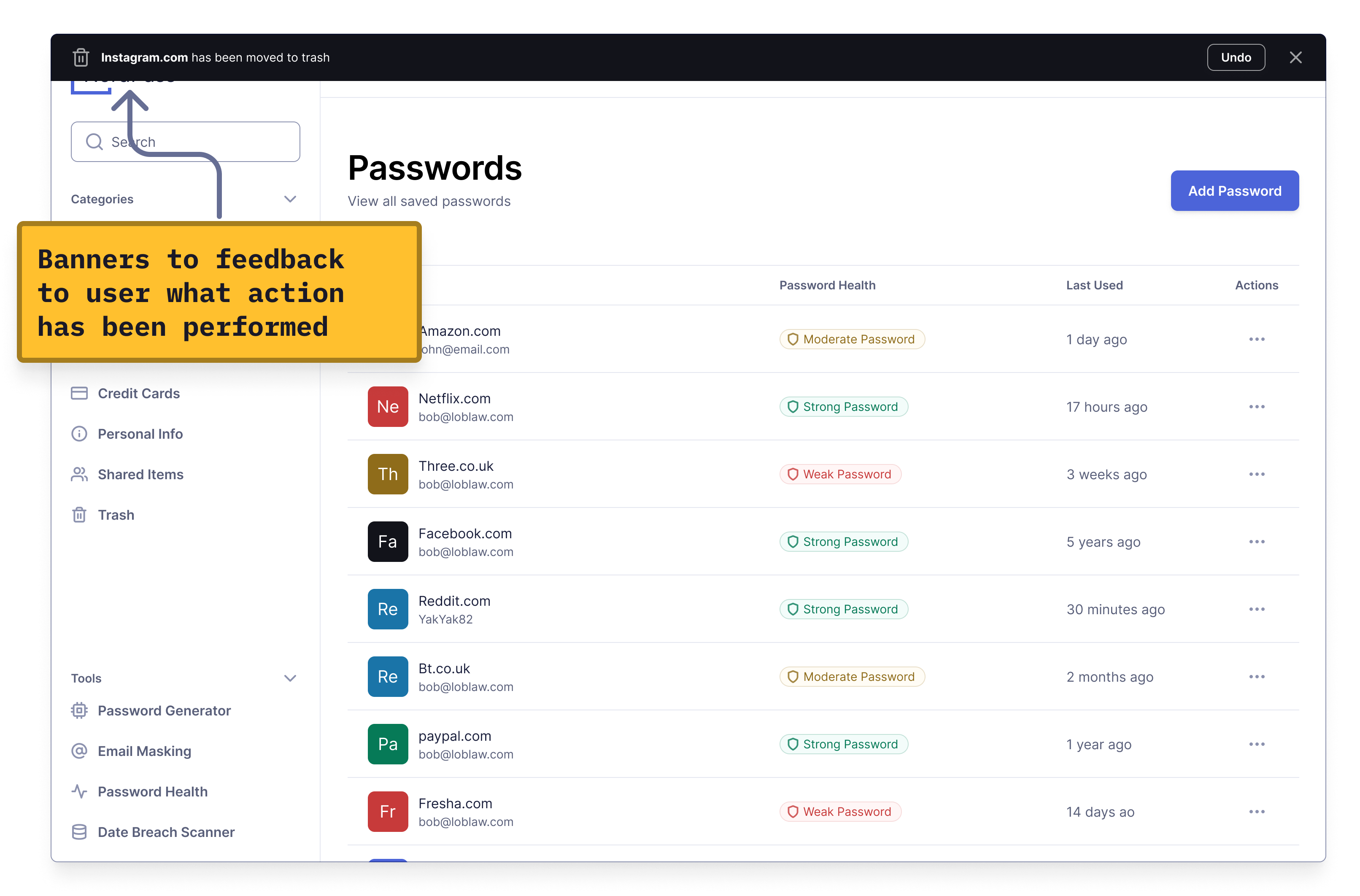
Effective feedback brings an app to life, making it feel responsive and helpful rather than just a black hole consuming input. While NordPass provides some feedback, there's room for improvement.
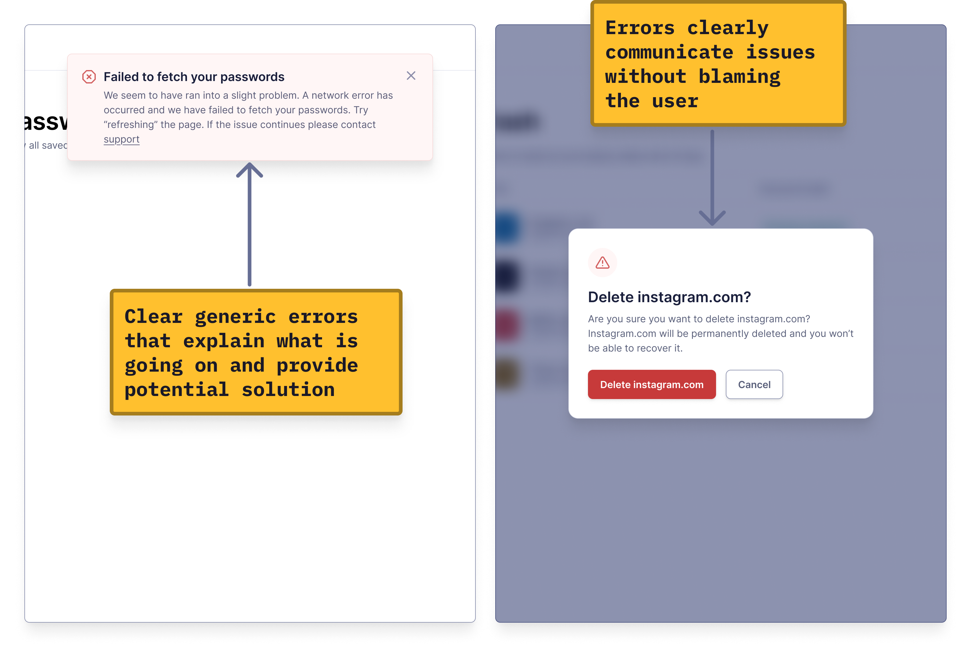
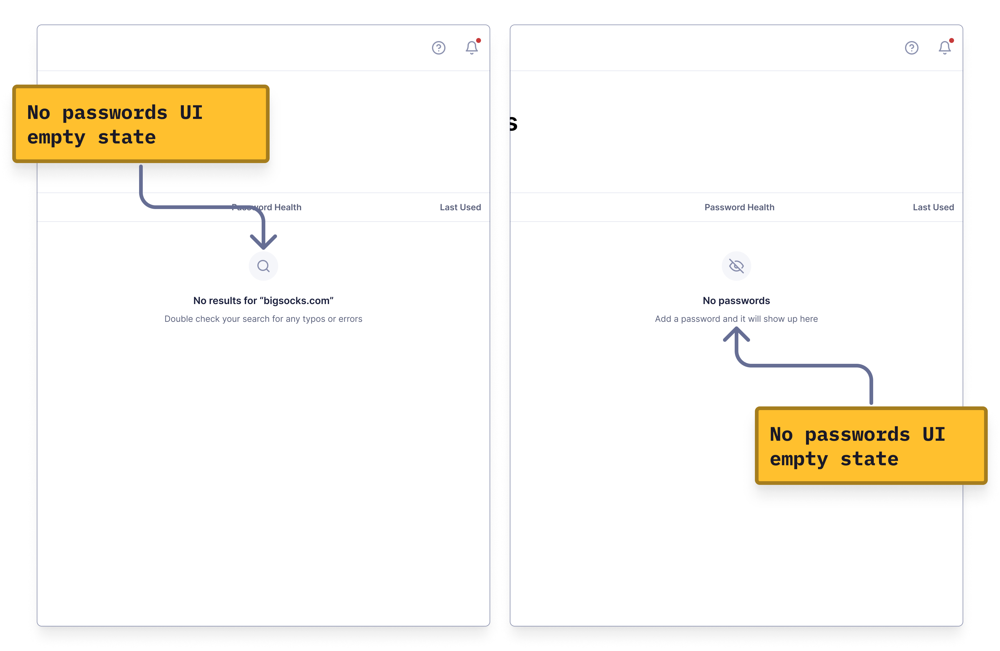
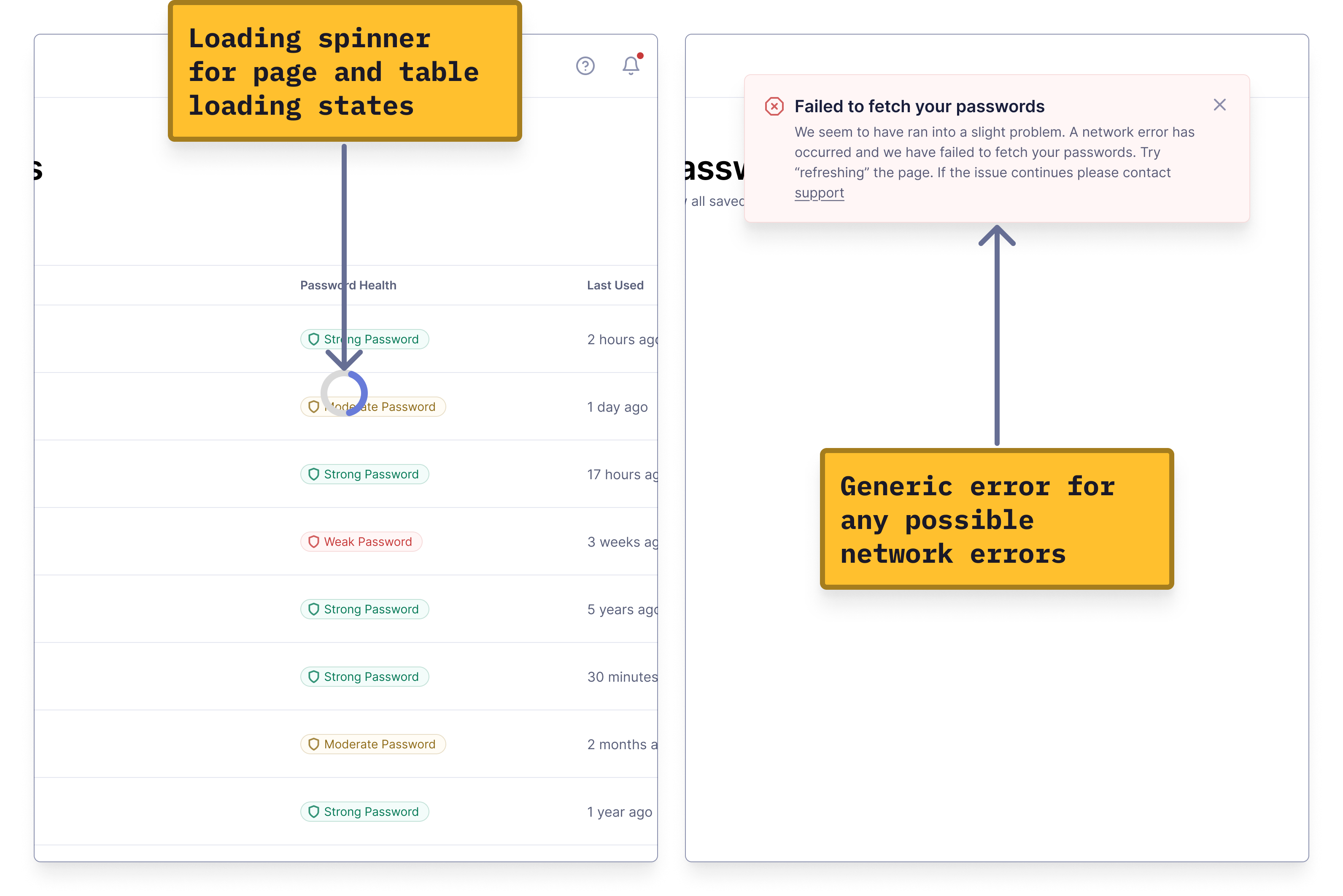
To create an app that feels polished and well-thought-out, you need to cover all the edge cases. NordPass handles some, but there are still a few it misses.
NordPass has great features, but its UI felt disjointed to users. By applying simple design principles, I was able to redesign NordPass into a modern, polished app that feels more professional, allowing users to better appreciate its features.
A product can have great features and UX, but if the UI feels thrown together, users will notice. A modern, polished UI enhances the user experience and lets the features truly shine.
Obvious form instructions, clear copy, strong feedback, and covering edge cases are what make a product feel complete.
Forms should include clear instructions and validation to prevent frustration.
Clear, specific copy helps users understand exactly what's happening.
Strong feedback ensures the product doesn't feel like a soulless black box.
Addressing edge cases makes the product feel thoughtful and well-rounded.
Redesigning NordPass taught me that good UX is crucial, but if you want users to see a product as professional, UX alone won’t cut it. You need a great UI too!